Hi, This is my blog. I'll blog about tech and medical tech news, most often from my own personal perspective or personal experience as a Filipino. Most of the time I'll be concentrating on tech stuff.
Saturday, August 3, 2013
FAMI web portal criticism - part 3
Back to part 2
Okay, now lets review the inside of the FAMI web portal.
The first thing I noticed upon logging in was that I was prompted to choose a new password because my old password was expired. If you go back to part 1 you will see that the password criteria is very strict. It took me over 10 min to decide on a password then. Its been less than 2 weeks since I made part 1. If the password expires once every 2 weeks or less than I am never going to use this portal again. Why the heck is the password expiry period so short? Never mind, I'm not going there.
For a website so paranoid about security, I'm curious as to why they do not use https web encryption.
Okay, moving on. This is the page that greets you once you are in, the main page.
Its a bit busier than the competitor's web portal main page as seen in part 2 but it does the job. Its divided into 4 parts.
The "investor summary" in the upper left essentially is the equivalent of the competitor's main page in part 2. Clicking the "+" brings up a popup with more info. It shows how many units you own, the latest NAVPS and how much its worth as of now.
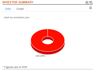
Clicking the "graph" tab merely brings up a graph showing what kinds of FAMI funds you own. Since I only own balanced funds i get a single 100% graph. A little boring.
In the lower left is the "statement of account". Its very similar to the "investor summary" with more data. The "graph" tab is also similar. You can limit it by time period. If you invested say 100 pesos in jan 2012, jan 2013 and may 2013, it will display 300 pesos worth. If you limit it from Jan 2013 to today, it will show 200 pesos worth.
In the lower right is the "Historical SOA". It should be available now since its after july 31 but its still down. FAMI should add it soon.
In the upper right is the "investment analysis". Unlike the "investor summary", it displays the amount you invested. Unfortunately it only shows a total amount within the time period specified. If you invested 100 pesos twice within the time period selected, it does not show each individual transaction but only shos the total of 200. Now this is a big limitation IMHO. The competitor's web portal in part 2 does have this. See pic below. FAMI should add a feature like this.
Verdict: Since the web portal seems to be in beta, there are a lot of bugs, wrong design and missing features. From just the web portal alone I would give it 3/5 stars. But considering the difficulty in signing up and logging in, I drop it to 2/5 stars.
The end for now
Subscribe to:
Post Comments (Atom)


No comments:
Post a Comment